Bridges Target Heart
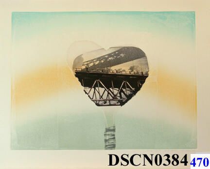
"Bridge's Heart" Print by Bill H. Ritchie 1973
The Henry Gallery Association commissioned me to produce a print. As the deadline was coming, I decided to use a more experimental idea. It was a hit! The bridge image and the lines crossing the imagery are from my drawings and video art work that were gaining momentum in 1973. Printing was a complex mix of lithography, relief and Chine Colle from a single etched zinc plate. Backstory: Late in 1973 I was awarded a commission to produce an edition of an original print for the Henry Gallery Association. The print was to be a new member benefit. They intended it to be an enticement to get new members. It was a windfall for our family not only for the money, but it also meant I would gain exposure to art collectors. My prints could become part of the art collections of some Seattle art mavens and some newcomers to the area. Making this print was a journey with a rocky beginning but a happy ending. I began work in November with a clear idea of what I wanted - a flowering shape surrounded by heavily striated, raster-like texture and, inside the shape, a target-heart. For etching the striations, I used a piece of corduroy fabric larger than the plate and impressed it in soft ground on zinc. Being zinc, it did not take long to etch in the corduroy pattern. I stopped-out places where I anticipated putting in the target-heart image. Then I imposed a tree-like shape enclosing it, recalling my stem-like forms with bulbous tops of tree-hugging work of ten years ago. It did not work. I gave up the target-heart shape and adopted my bridges theme. The bridge image is of two-color lithograph from an aluminum plate, printed on a Japanese paper. I tore out the image, ripping around a metal template to create the shape. As I would have to print-and-tear as many lithographs as there would be prints in the edition, the template assured that all the torn free-form shapes would be alike. These would be chine-colle’d into the paper when the inked zinc plate was printed. Doing this process laminates the Japanese paper permanently to the main sheet of paper. Still, it did not go well, and it would go from bad to worse until nearly next year’s January 31 deadline. The lesson I would learn from this is I do not work well on commissions – art on demand as it were. My most creative work seems to come out of thin air, and never motivated from paid commissions. While it did not seem like it at the time, the prints would eventually turn out well. Strangely, even the early trial proofs won prizes at the International Invitational of the Philadelphia Print Club and, almost simultaneously, the Springfield Arts Center! A footnote to the Philadelphia award would come forty-two years later when I would receive a Membership at the Philadelphia Art Museum because my print is in the Print Club’s holdings – a nice perk, but I had stopped flying by this time.