Label Type
Cultural/Historical ContextLabel
Mason learned about art and wildlife from his father Frank E. Mason, a Batavia, New York engraver. An art correspondence course provided additional training, as did tips from mentor and artist Chauncey Ryder. From Ryder, he learned the "three values of color," a theory whereby the artist brought the foreground into sharp focus by accenting dark areas with a light object or vice versa, whereas the main color motif occupied the middle ground. While Ryder was a Tonalist, a form of landscape painting where neutral colors were used to create a misty landscape, Mason favored saturated colors for his oil paintings.
Mason sketched en plein air, believing that reality gave his work vitality. However, he also believed that plein air painting led him to include too many details. By studying and editing his plein air sketches, Mason produced more dramatic compositions.
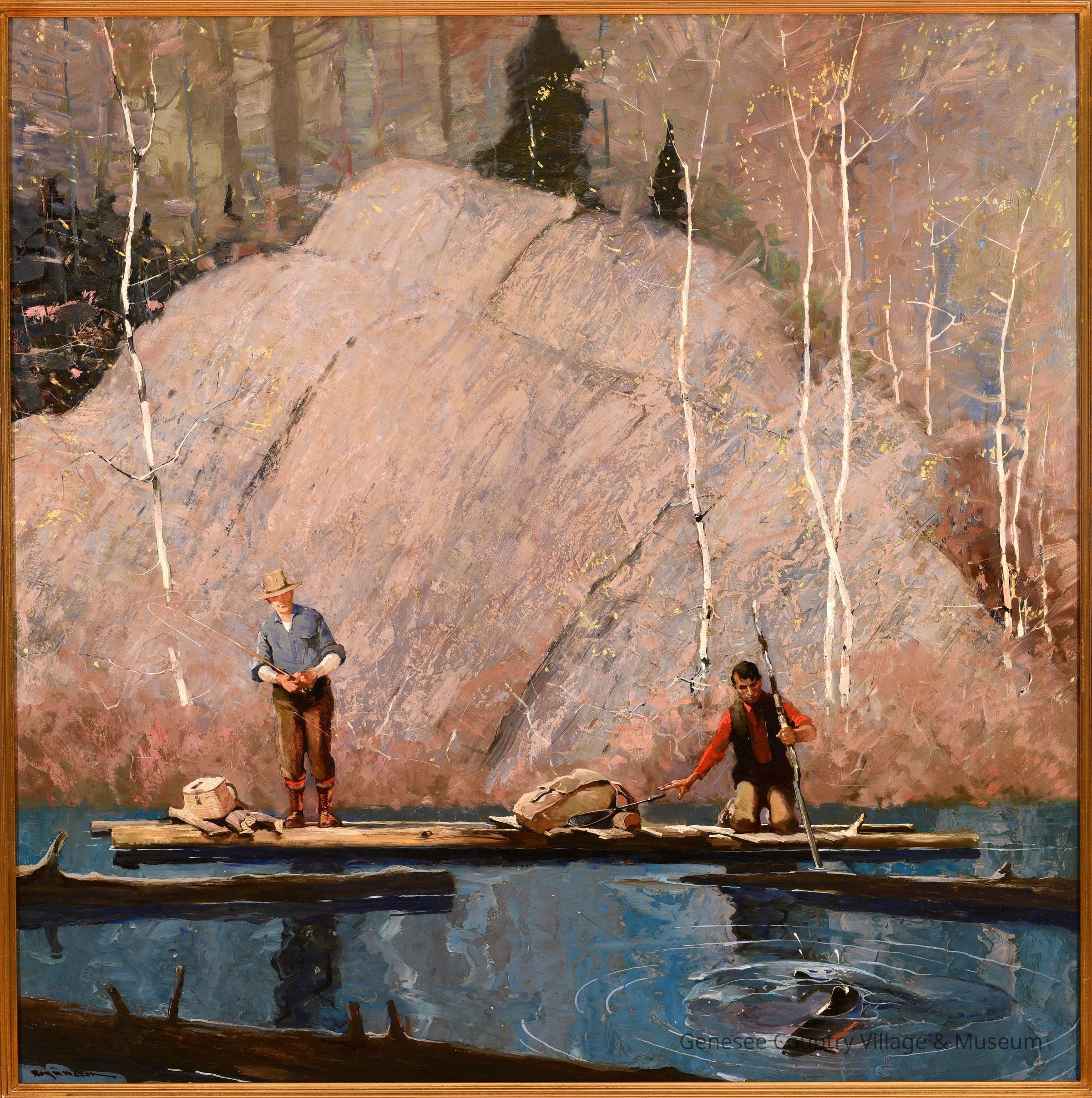
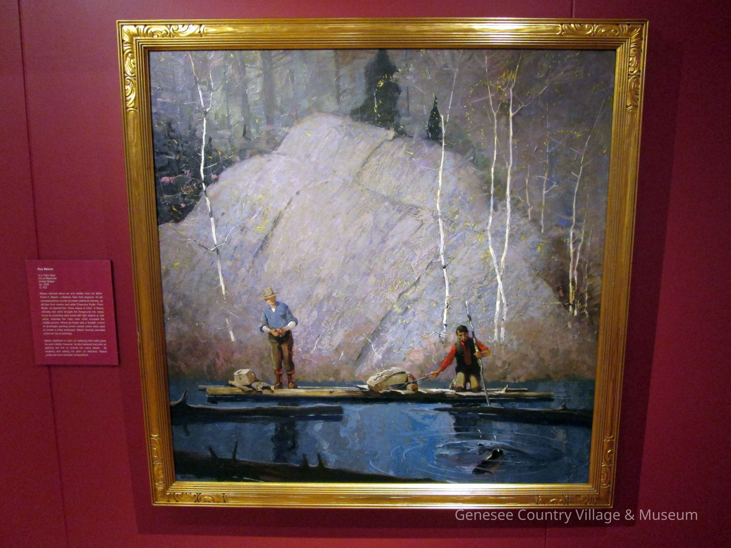
Mason brought his fishermen into sharp focus with a clever use of horizontal and vertical lines, along with triangular forms. White birches lead the eye downward to the picture's main characters: the fisherman in blue, the guide in red. Look for triangles in the rocks, trees, in the torsos of the fisherman and in the birches themselves. Mason also balanced his work by alternating dark and light, warm and cool values. Light accents highlight the dark, and dark patches contrast with lighter areas. At the water's edge, a warm haze of orange contrasts with the cooler tints of the water and rock.Label Type
Cultural/Historical ContextLabel
Mason learned about art and wildlife from his father Frank E. Mason, a Batavia, New York engraver. An art correspondence course provided additional training, as did tips from mentor and artist Chauncey Ryder. From Ryder, he learned the "three values of color," a theory whereby the artist brought the foreground into sharp focus by accenting dark areas with a light object or vice versa, whereas the main color motif occupied the middle ground. While Ryder was a Tonalist, a form of landscape painting where neutral colors were used to create a misty landscape, Mason favored saturated colors for his oil paintings.
True art editor Harvey Van Valkenburg marveled at the family's influence: "Would you believe that Mr. Mason never went to an art school - that he attributes his success to his wonderful family who raised him close to the ground, but taught him to keep looking up?"