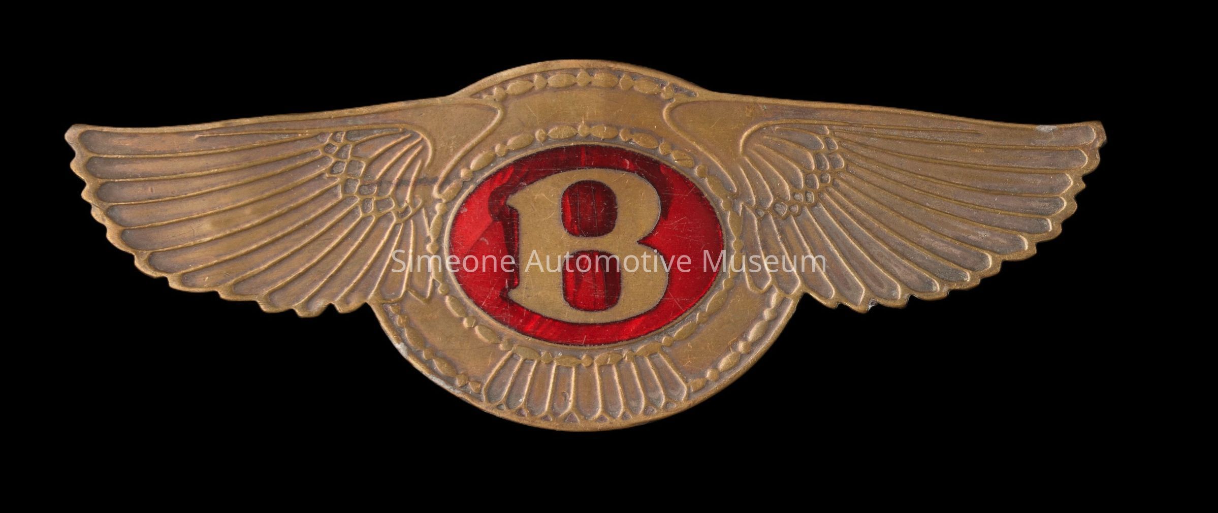
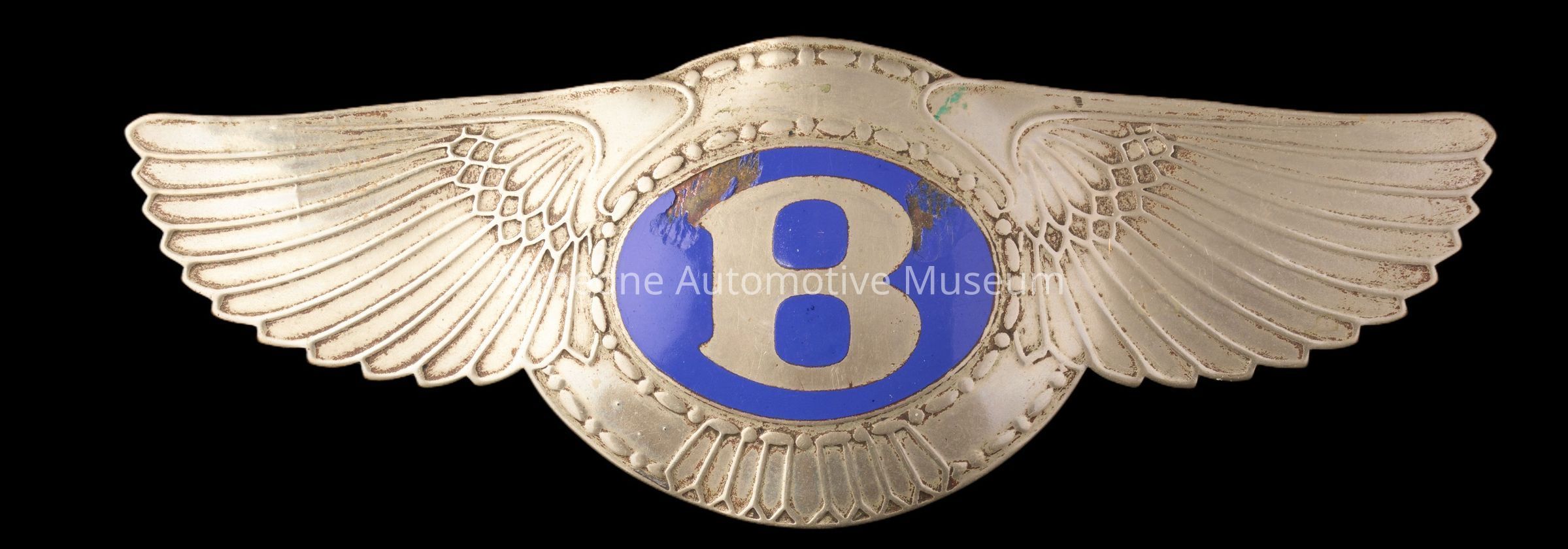
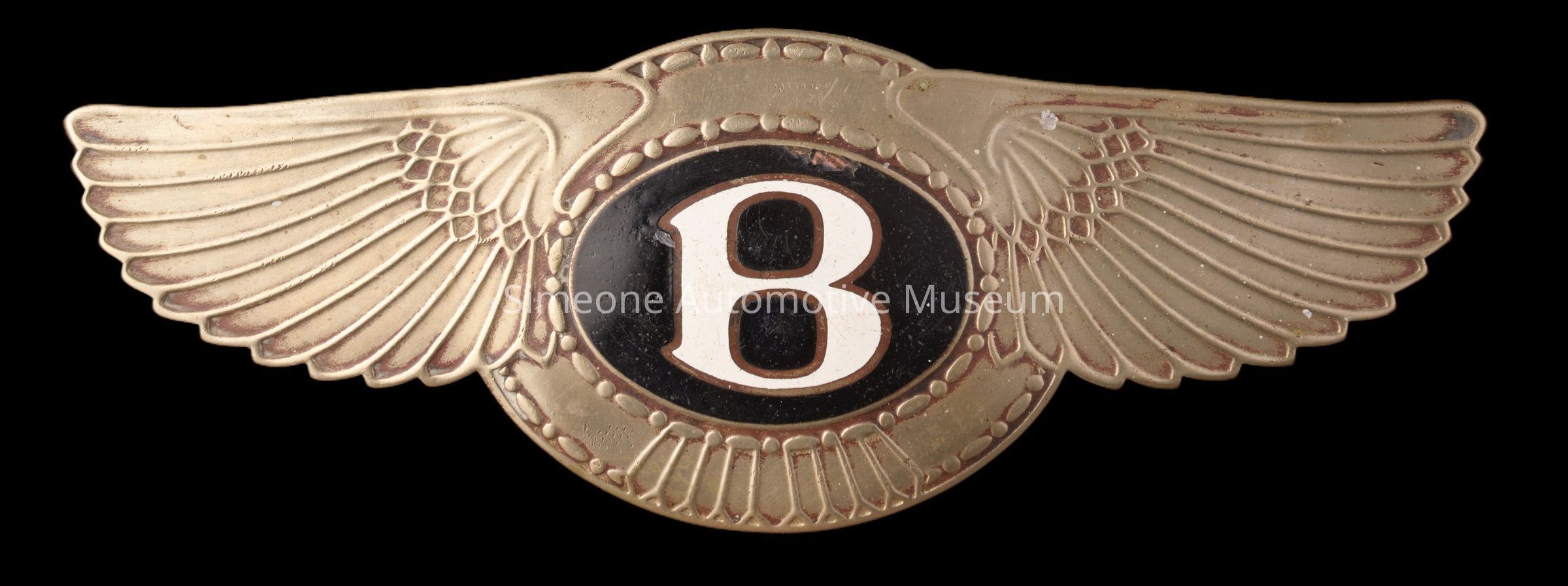
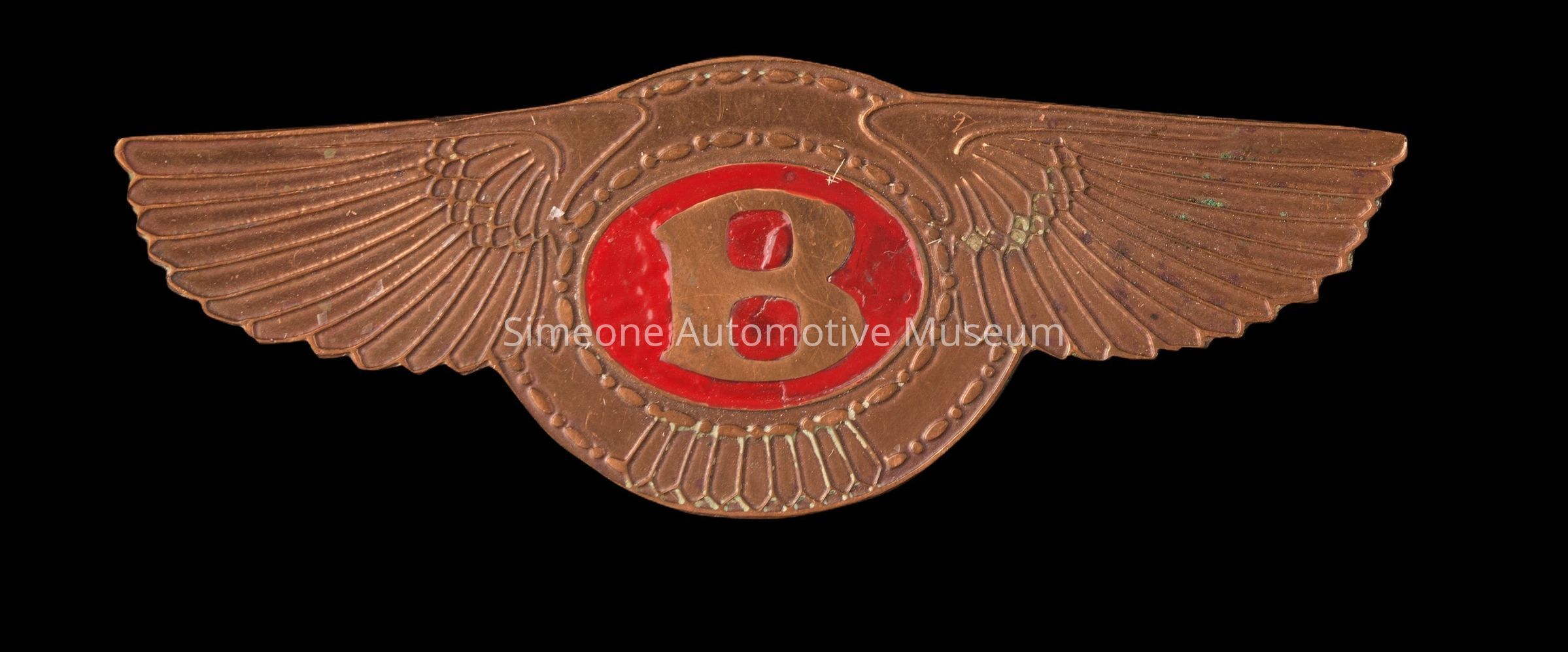
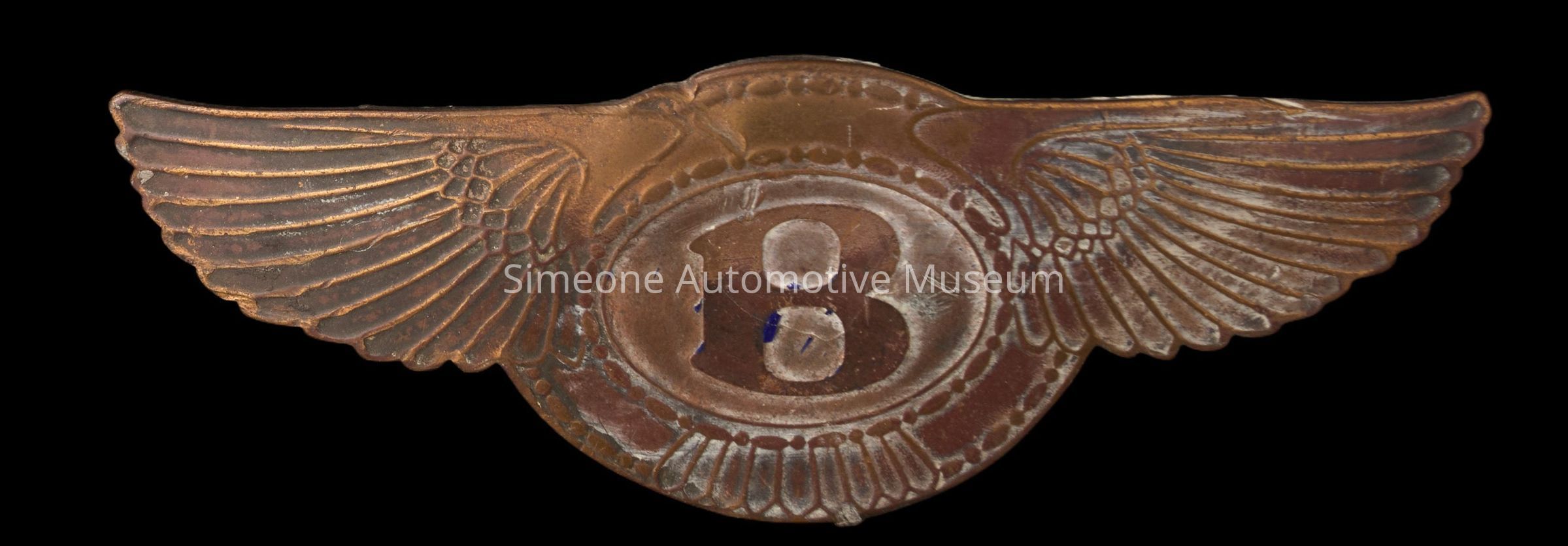
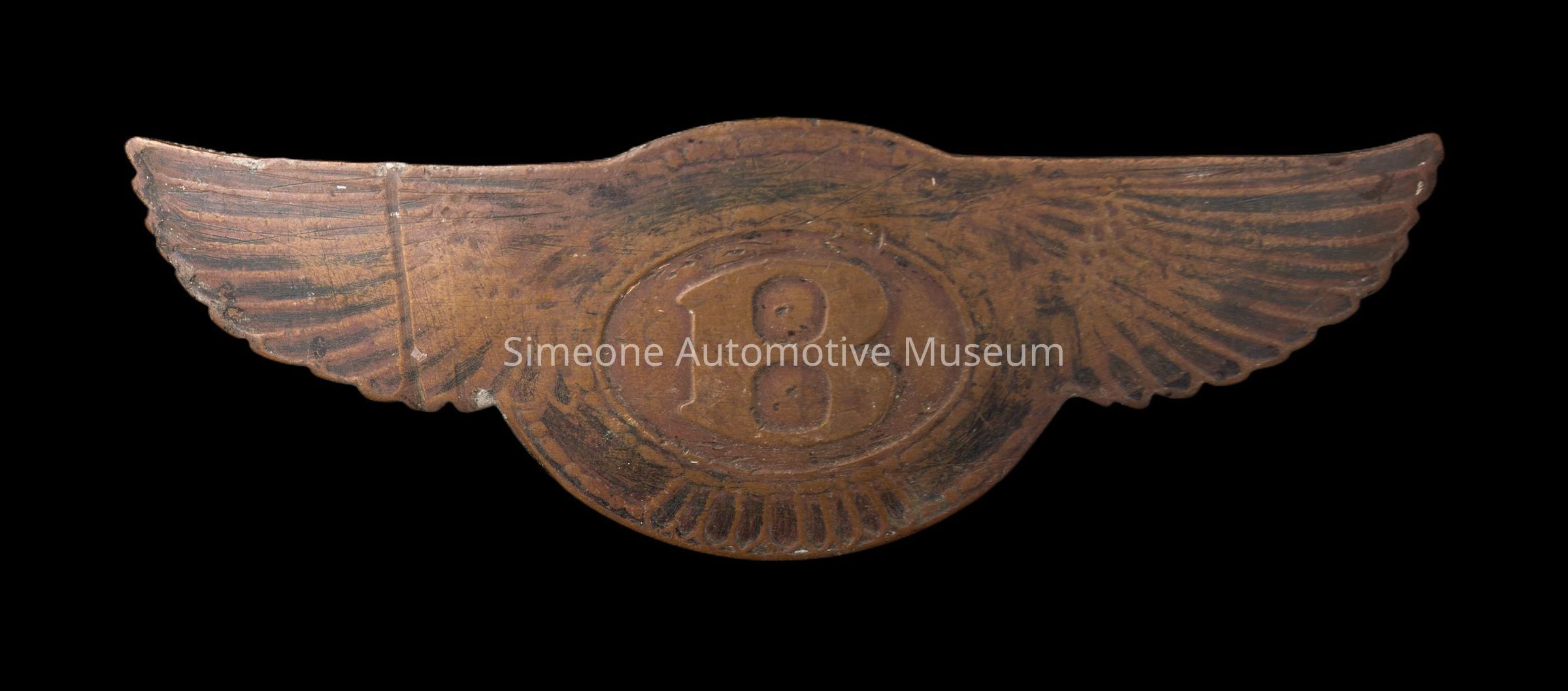
Six Bentley Logos
Name/Title
Six Bentley LogosEntry/Object ID
2024.14.203Description
The Bentley logo debuted in 1919 when W.O. Bentley commissioned Frederick Gordon Crosby to design an emblem that embodied speed, elegance, and aviation heritage. Crosby’s design featured a bold capital “B” encased in a circular frame, flanked by stylized wings. A clever detail was the asymmetrical feather count on each wing, intended to deter counterfeiting. The oval behind the “B” varied in color depending on the car: black denoted standard luxury models, red signified high-performance editions, and green represented Bentley’s racing lineage, particularly its success at Le Mans. Through the years, the logo evolved while retaining its core identity. In 1931, after Bentley was acquired by Rolls-Royce, the wings were streamlined and made symmetrical, reflecting a more conservative elegance. By the 1990s, asymmetry returned to highlight Bentley’s sporting heritage. Under Volkswagen ownership in 1998, the logo was modernized with sharper lines, metallic finishes, and three-dimensional detailing, reintroducing subtle asymmetry as a nod to Crosby’s original design. Most recently, in 2025, Bentley unveiled a futuristic reinterpretation of the Winged B, blending heritage with contemporary luxury aesthetics.Use
The Bentley logo was mounted on teh top front of the radiator shell.Collection
Dr. Frederick A. Simeone Founder Collection, Simeone - AutomobiliaCategory
Automobilia, Bentley Motors Limited